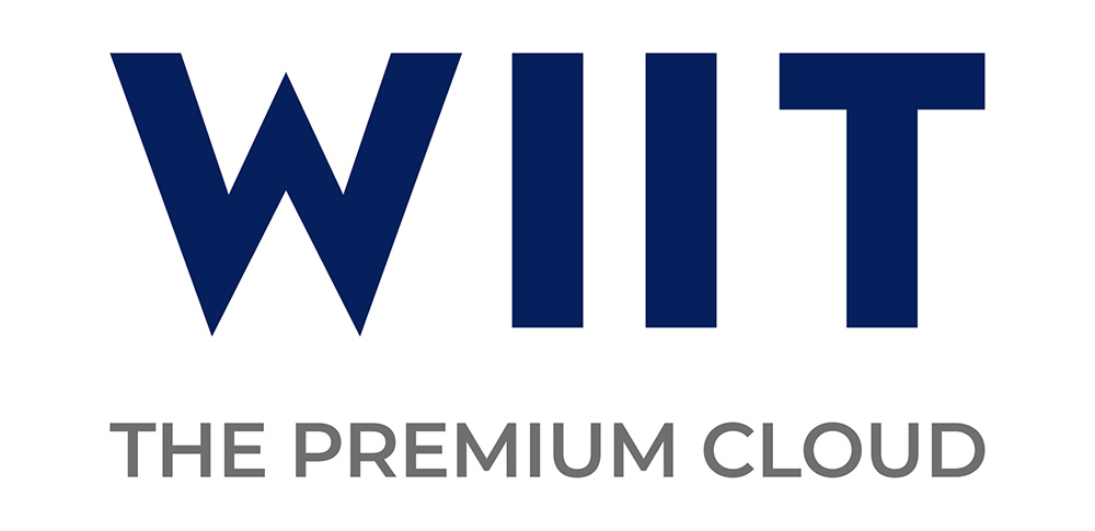
REBRANDING WIIT
CHALLENGE
WIIT, a leading provider of premium cloud services, has grown and changed a great deal since the first, and historic, logo was created more than 20 years ago. Its increasingly comprehensive and high-quality offerings, its listing on the stock exchange and its acquisitions have made WIIT a central player worldwide. For this reason, the company expressed the need to define a brand identity that better reflected its new positioning, values and ambitions.
IDEA
The new logo, designed by us, perfectly reflects the Group’s new positioning. The lines, essential and decisive, tell of a solid, ambitious company that is aware of its strength. The characters of the past make way for a new capital lettering that conveys the company’s distinctive features without sacrificing elegance. The colours, which have remained unchanged, ensure continuity with the past. The blue “W” of WIIT is set to become a true premium quality brand in the cloud sector.
In addition to the restyling of the logo, WIIT has chosen a new pay-off – THE PREMIUM CLOUD – that well represents the group’s vision: to be the Cloud Provider of excellence for the most important Italian and international companies.


